Intel Search
the Problem
Intel.com's wide-ranging user community uses the search feature for varying reasons and to find varying content like documentation, support, and product information. Currently, with the existing basic search functions, finding the correct information can be difficult.The ask
How might we deliver a robust and personalized search experience that delivers answers, encourages increased search usage, and improves the findability of desired content?timeline
6 monthsrole
UX and Visual DesignerIMPACT
*Led the design process including working sessions with clients, ideation, prototyping, and high fidelity design.*Created funcitonal prototypes to test with users.
*Delivered desktop and mobile designs to our developers for 4 new search features.
Process
project strucure
For this track of work, I led the UX and visual design with oversight from the design leads, worked directly with PMs and developers, and presented and communicated directly with client stakeholders. As part of an ongoing evolution of the Intel.com global search and strategy, I picked up work from a previous designer to continue to make improvements and updates. Our team used Axure RP for ideating and creating prototypes for user testing, and Sketch for visual design and handoff.understanding the user
When gathering context before starting work, our client provided us with feedback about the current state of the Intel.com search from real users. These comments included:
From the feedback, we outlined these goals for the continued track of work:
- Designing and implementing an advanced search feature
- Designing a treatment to show search tips to users
- Updating and creating design library patterns for improved result cards and filters
- Applying the new search updates to other programs across Intel.com
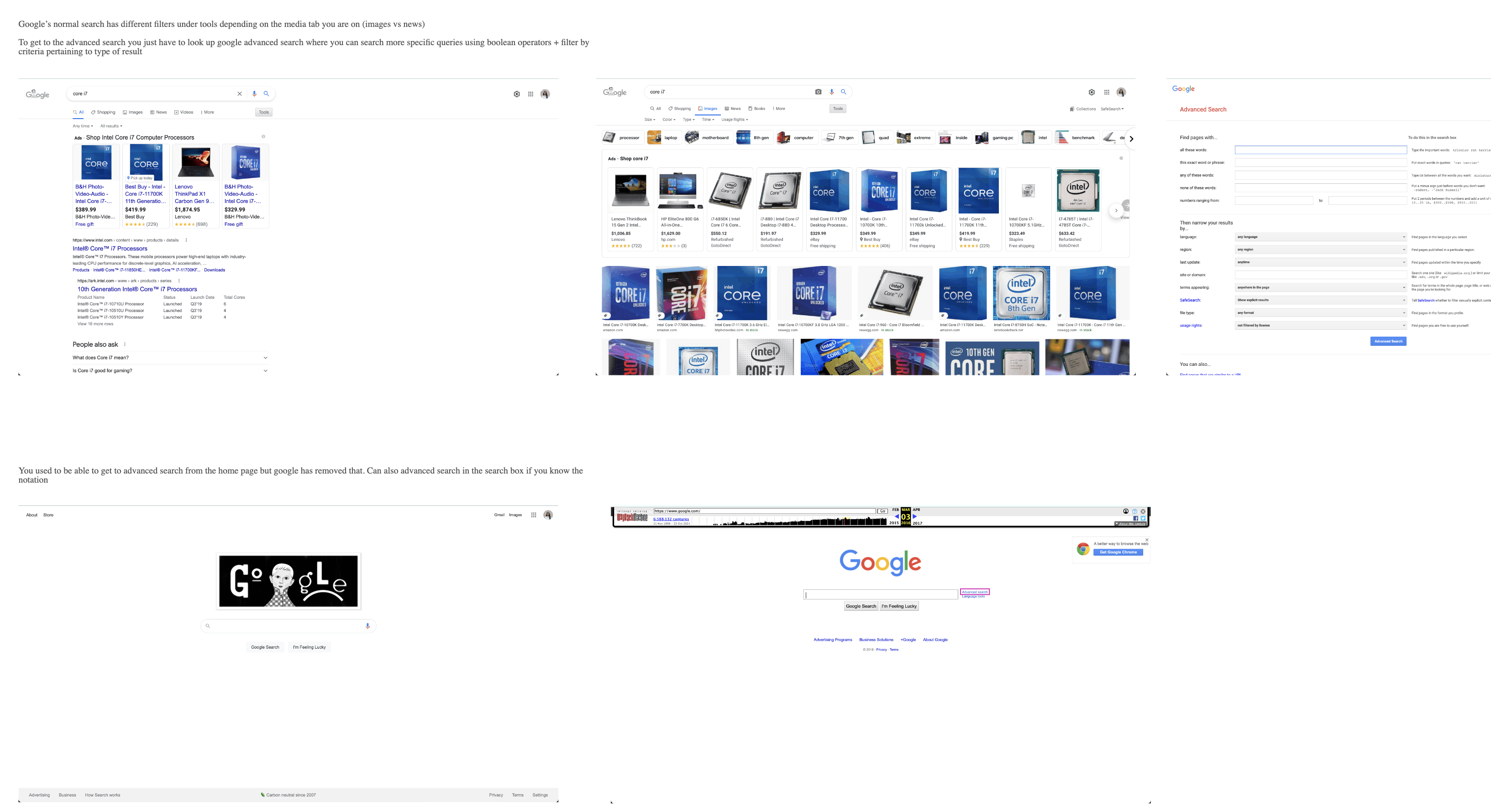
competitive anaylsis
Before brainstorming, my team and I conducted a competitive analysis of search functions on competing brand websites and for major search engines. We noted interactions, filters, advanced search filters, and how results were populated.


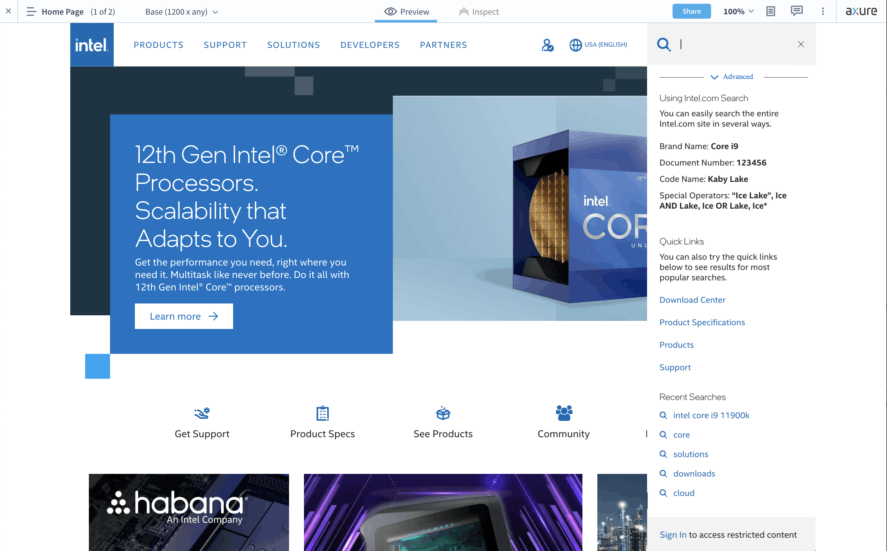
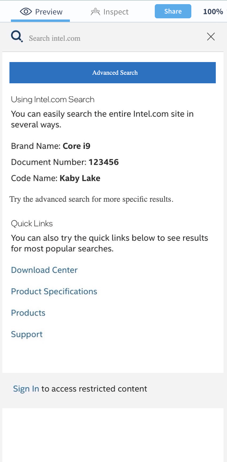
designing wireframes & prototypes
Starting in Axure RP, I designed wireframes with different ideas to present to my internal team and the client. I designed different variations for each feature, and either noted or prototyped different states to show behavior and flow. These ideas revolved around updates that could be made to the global search flyout from the home page as well as the search bar on the search results page.


After each round of client review, I updated designs to incorporate feedback, and refined the prototypes to be fully functional, responsive, and clickable for user testing.

user testing & refinement
Our clients worked with an external agency to conduct user testing. Users were asked to find and engage with the search prototypes in both the global search and on the results page. *65 participants total: 15 participants in an Audio test, 50 in Non-audio
*Two internal users were tested
*Screens were recorded to monitor activity
Participants were asked to locate the advanced sarch functionality from the global search box, and to refine their query on the search results page.
*Locating advanced search: 95% success rate (62/65) however, with lag time
*Refining query: 66% success rate (43/65) with multiple clicks in some instances
Based on these results, our team determined that the advanced search features may not be fully intuitive, potentially obscured when other features were engages, but that the features were useful and overall made sense for this context. I further refined the prototypes, and created different versions to use for AB testing for final decisions. You can view the prototype here.

A: Explicit “Advanced Search” CTA

B: Clickable icon
visual design
During the visual design phase, I continued to refine feature behaviors with more input from clients, PMs, and the tech team.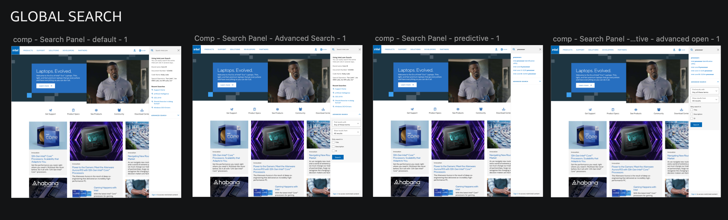

Additionally, our team consulted with an accessibility expert to ensure the designs were accessible and usable. From the accessibility reviews, we determined that:
- Behavior on the global search and results search should be the same as not to confuse users
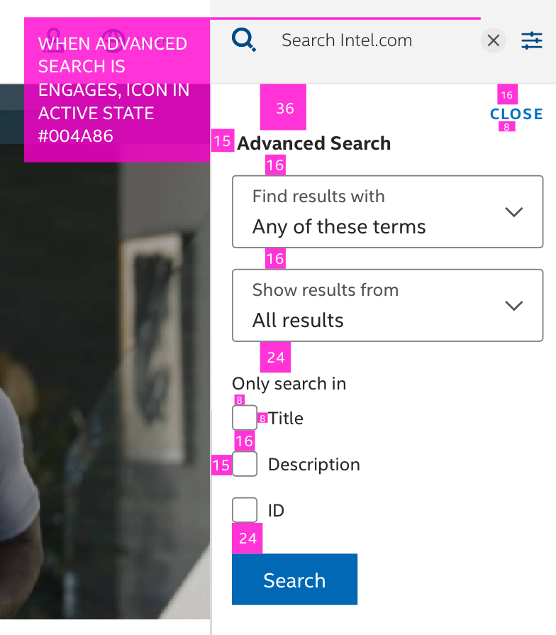
- We needed to increase tap affordance between advanced search filters especially on mobile screens
- The search results dropdown should not obscure the ability to use the advanced search
Hand off & QA
After the designs were revised and finalized, I marked up each screen with detailed specs and interaction behaviors before passing off files to the tech team to implement. After handoff, I met weekly with the tech team for QA sessions where I reviewed the testing environment sandbox to ensure that the designs were reflected in implementation.
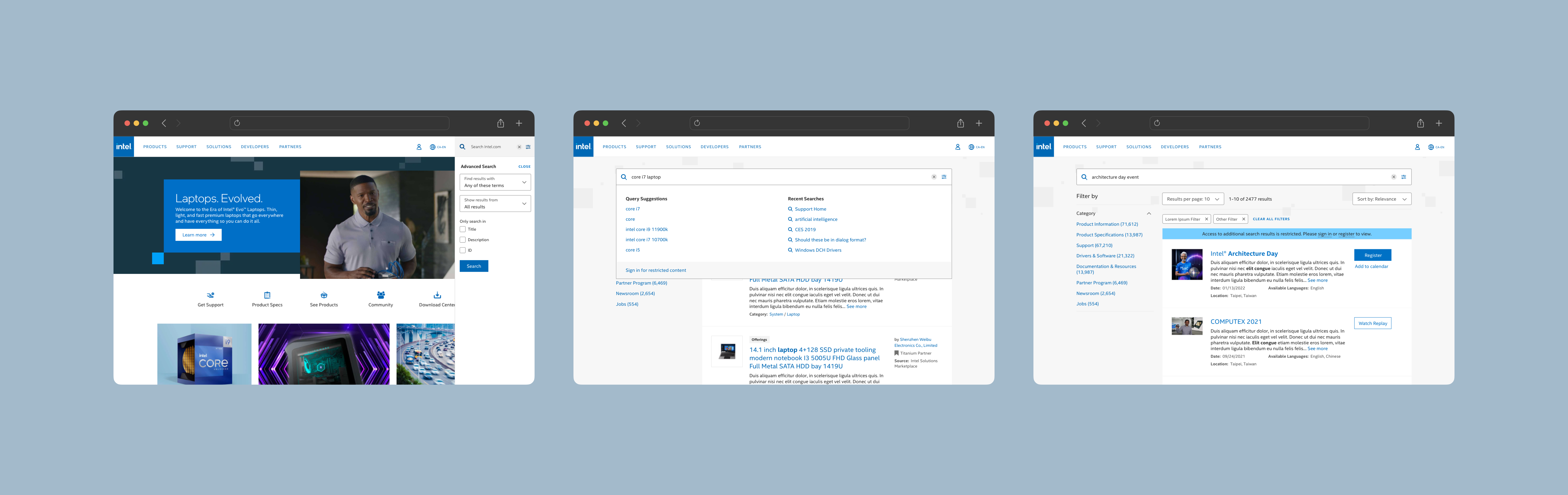
Final Designs

Global Search - Advanced Search

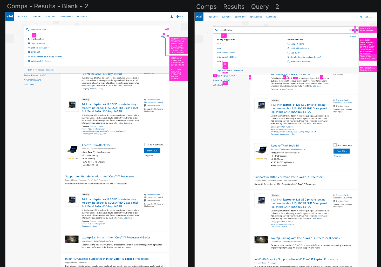
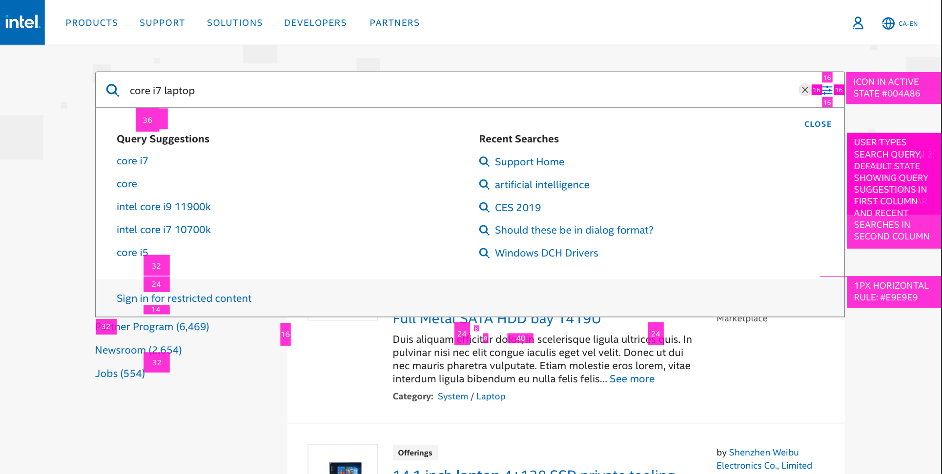
Results Page - Advanced Search & Search Tips

Search Results - Date Filter

Event Search Results Card
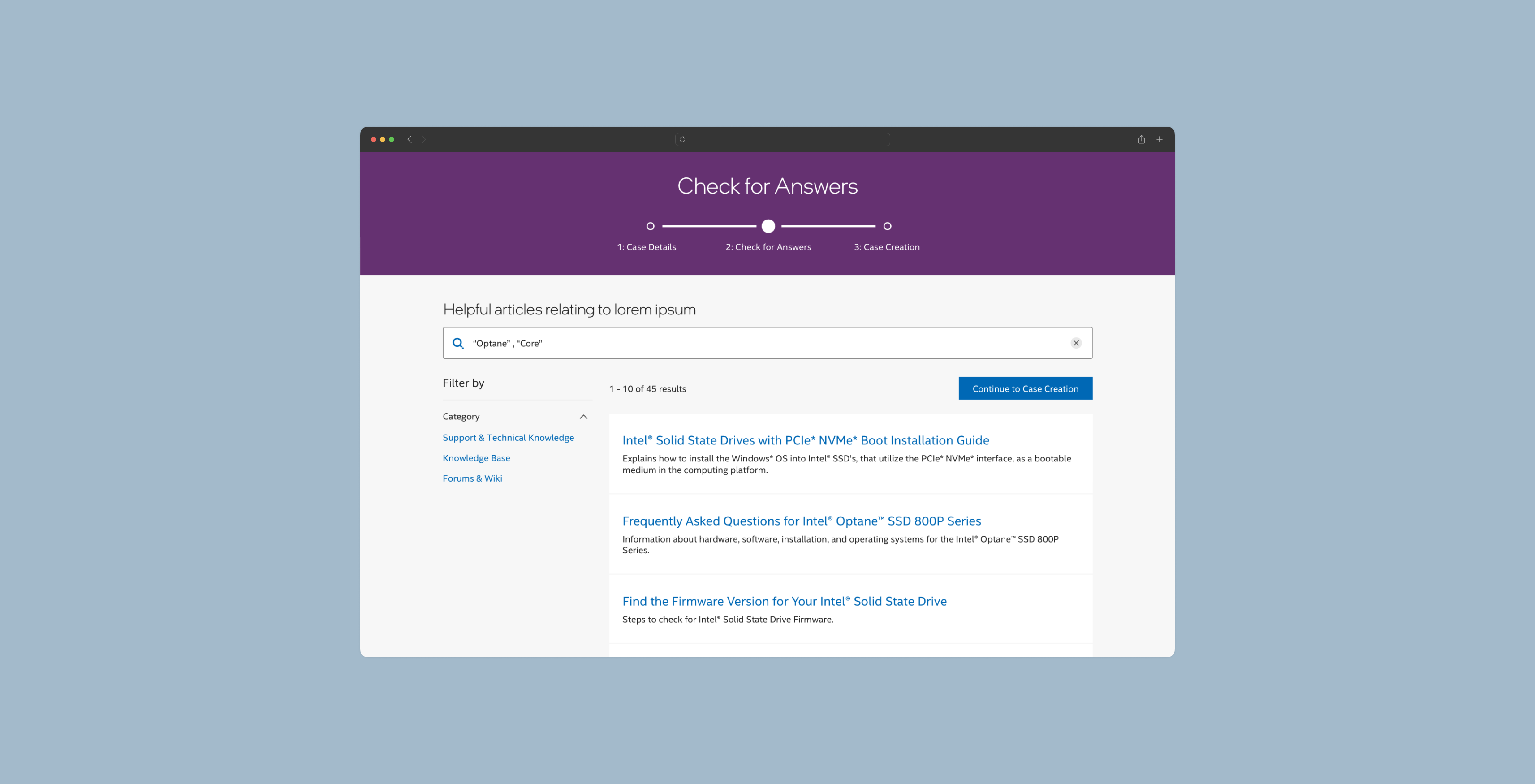
Intel Developer Zone - Search Before Submitting Ticket
Takeaways
- Learning how to create dyanmic prototypes in Axure RP
- Learning how to use quantitative and qualitative testing metrics to make informed design decisions
- Learning how to communicate with the product and tech team to conduct QA
- Learning how to rework behavior of a feature to ensure it passes accessibility guidelines
Some feedback from my team:
“Cheri slotted right into the cadence of our workflow. She is a quick learner, self directed, and can manage a project completely. She is cordial and knowledgable when presenting to the client. She has handled multiple UX prototypes that required reserach, exploration, reviews, and reworks”
-Associate Creative Director
-Associate Creative Director
“Cheri has stepped up wherever needed and challenged herself to learn new tools. She has filled both visual design and UX craft roles for us and excelled at both. Cheri’s client reviews not only show that she listens to their feedback but also follows through on their requests. When presenting designs, Cheri doesn’t just say what we did, but why.”
-Creative Director of Experience
-Creative Director of Experience
More Projects

Redesign and delivery of the desktop & mobile ecommerce platform and design system for Do it Best and their member stores.
Learn more ︎︎︎
Learn more ︎︎︎
Reimagining the experience for the Oral-B SmartSeries connected mobile app to increase user engagement.
Learn more ︎︎︎
let’s chat!
designed by cheri wang & running on Cargo