Do it Best

Background
Do it Best’s revenue stream includes wholesale (B2B) sales to Do it Best members and direct-to-consumer e-commerce sales (B2C) from their 2,000+ Do it Best member stores and 3,000+ retail stores across the U.S. They needed to undergo a platform transformation to create an industry-leading, unified, and intuitive shopping experience for hardware end-customers. the ask
How might we design an e-commerce website for Do it Best and their member stores with an exceptional shopping experience that gives customers simplified shopping pathways and drives more growth online and in-store?timeline
6 monthsrole
UX and Visual DesignerIMPACT
*Delivered and handed off a completely redesigned e-commerce website and member site template.*Built components and page templates to use and author in the Adobe CMS.
*Owned 4 and collaborated on 9 features.
*Designed, organized, and handed off a new design system.
Process
project Structure
For this project, our team worked in a 2-week sprint cadence where we designed different features of epics each sprint. This project timeline was fast paced, with 187 MVP features to be designed within 12 sprints. During each sprint, I was assigned features to work on individually, worked on designing and organizing the design system, and collaborated with my team members to ideate and assist them in optimizing their desktop designs for mobile. Although each feature had their own set of unique business requirements and constraints to consider, throughout this project we established these overarching goals:
- Design a consistent experience for customers across DoitBest.com and their member sites while enabling member differentiation and customization.
- Design for mobile responsiveness so the platform performs seamlessly across screen sizes.
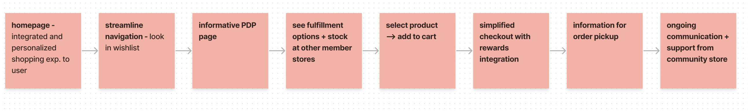
- Create simplified pathways to purchase by increasing search, navigation, and browsing ease, and minimizing cart complexities.
- Clearly document interactions and functionality in hand-off notes for delivery to developers.
- Solve for edge cases and error states.
Understanding the Users
Customers can shop Do it Best from their main retail site as well as their co-op member sites. To understand the users and their entry points to Do it Best, the experience team created two different personas with two different purchasing journeys.*Do it Best Driven Purchase Journey
![]()
![]()


*Member Driven Purchase Journey
![]()
![]()

Framework
Before execution, the experience team conducted an 8-week discovery to establish the design direction and plan for Do it Best. These deliverables included a preliminary brand toolkit, a sitemap, and main page wireframes.

From there, our team finalized the design language based on the positioning and personality of the preliminary branding, and we built out a full design system with authorable components and variants. The design system was created by myself and a Senior Designer, both individually designing certain elements and collaborating on others.

With each component, we wrote out detailed use cases and specs for delivery to engineers and the client who will be authoring these components when customizing their sites.

Designing Features
For each feature I worked on, to start, I conducted a competitive analysis of competing hardware sites as well as popular big box retailers to understand the current landscape from industry leaders.
Next, with the business requirements written by our product team and consideration from existing UX research resources, I started wireframing initial ideas to share during internal reviews. These wireframes helped me iterate ideas and understand which screens would be needed for final delivery. Additionally, I documented user interactions like clicks, page navigations, and pop-up modals, and worked with our tech team to ensure that these interactions were feasible to implement.
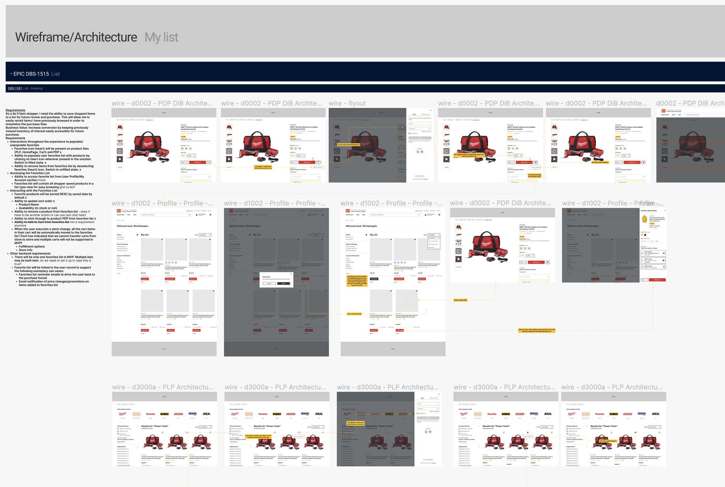
After iteration from the internal and client feedback, I created high fidelity prototypes for the features and wrote handoff notes in the file to document interactions and flows. These Figma pages were handed off directly to the tech team for development.


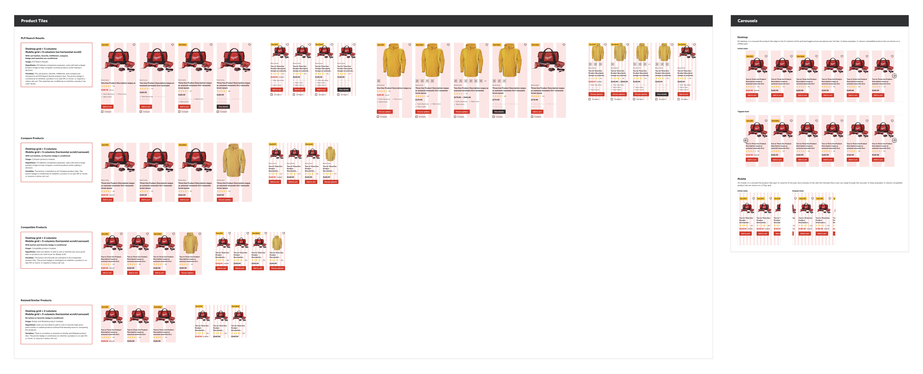
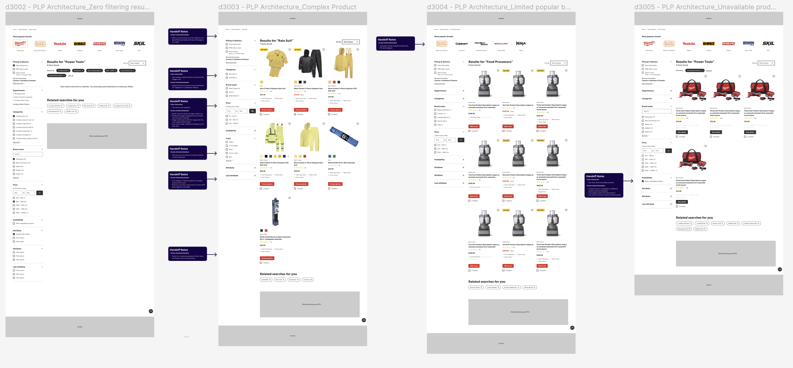
In instances where edge cases needed to be considered, like on the PLP, page behaviors and variations were designed and documented.
Usability
When designing components and features, usability considerations like tap affordance, touch target sizes, and mobile screen behavior were considered. For example, when designing mobile product tiles and the mobile PLP, ensuring that there was sufficient information presented to users on the tiles to help them select a product, while ensuring that all touch targets were tappable. Additionally, when designing the store locator feature, I adjusted the scroll behavior of the content after testing screens on a small viewport.
Final Designs

Home Page
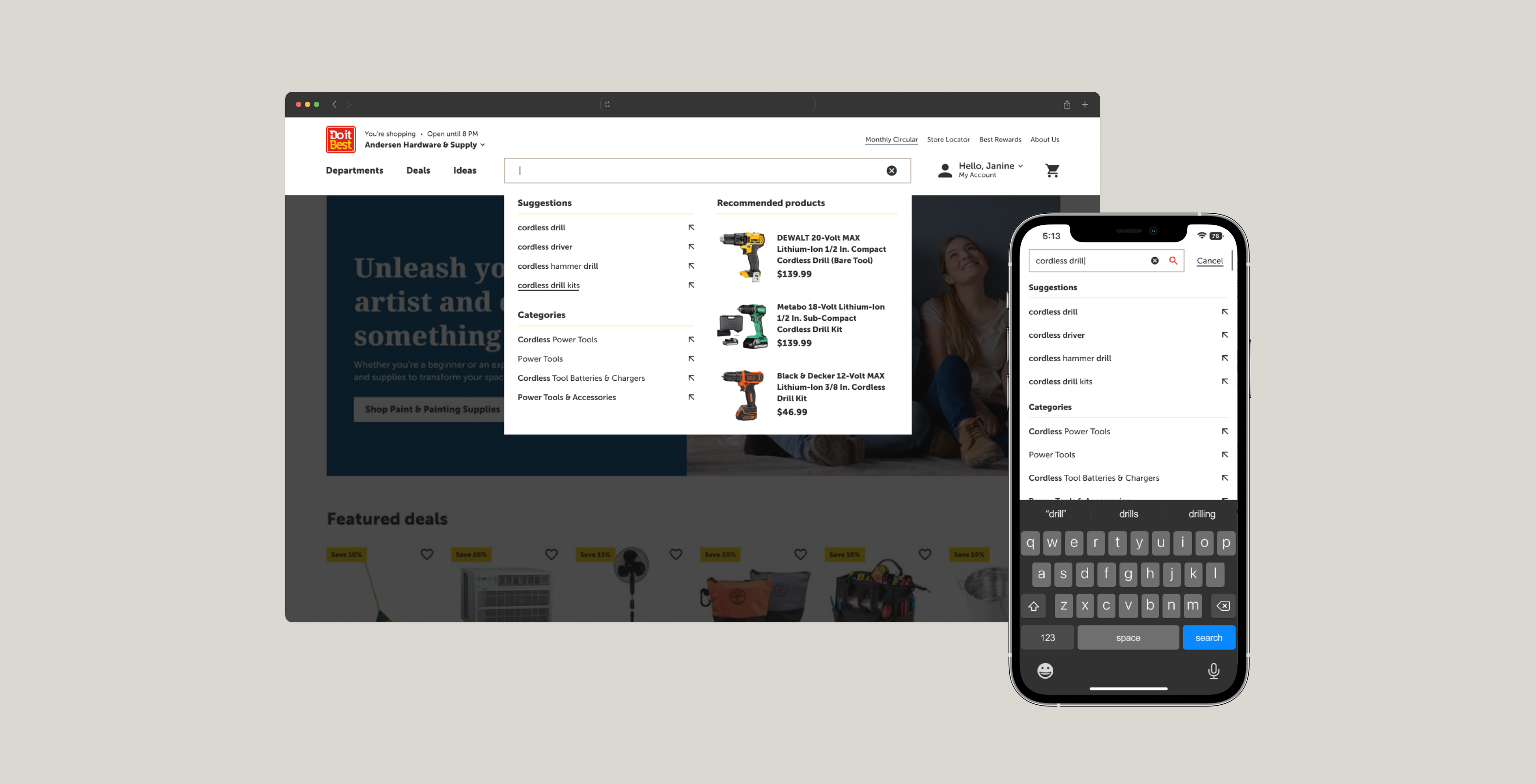
Search Results
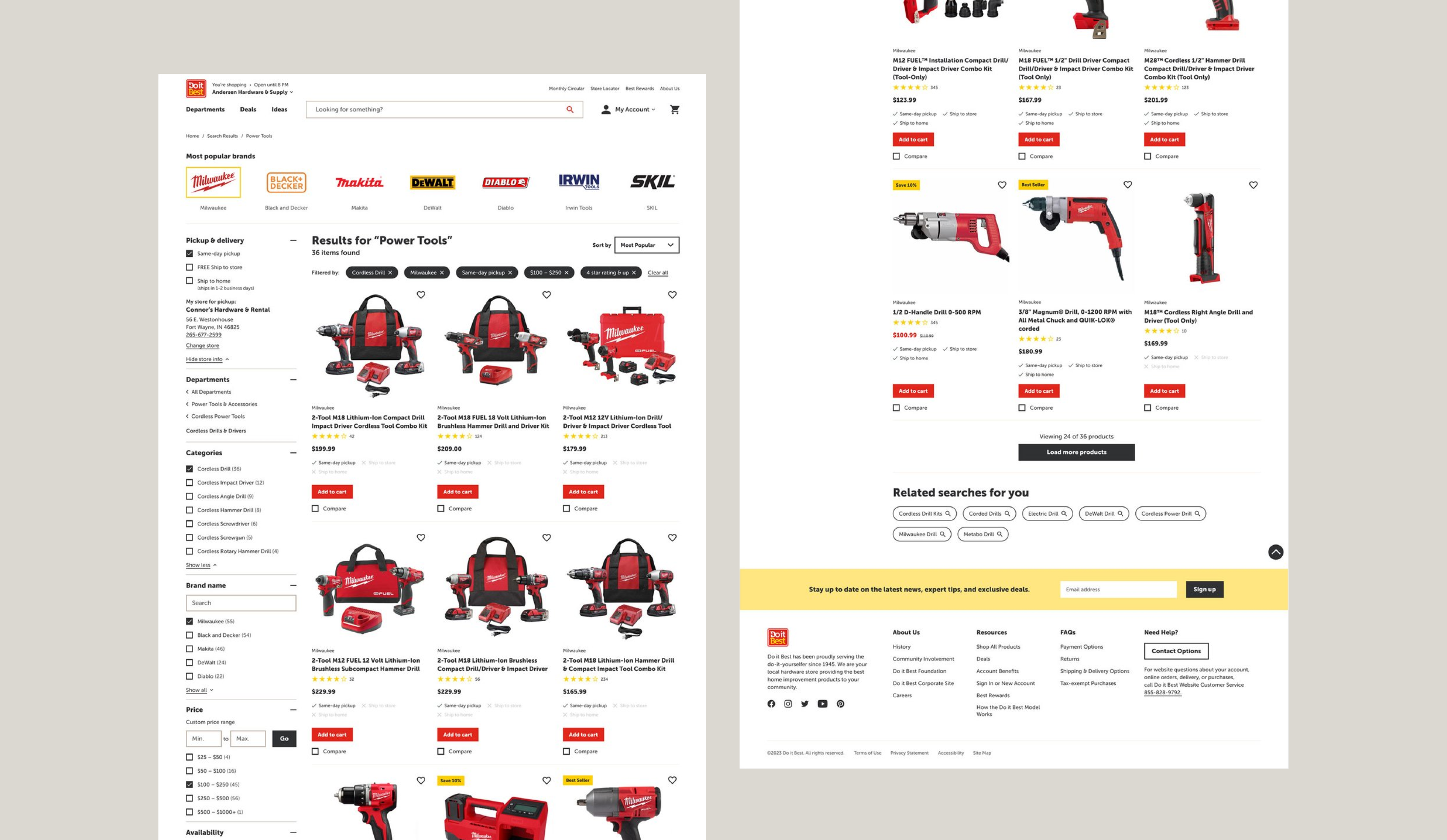
Product Listing Page

Compare Products Feature
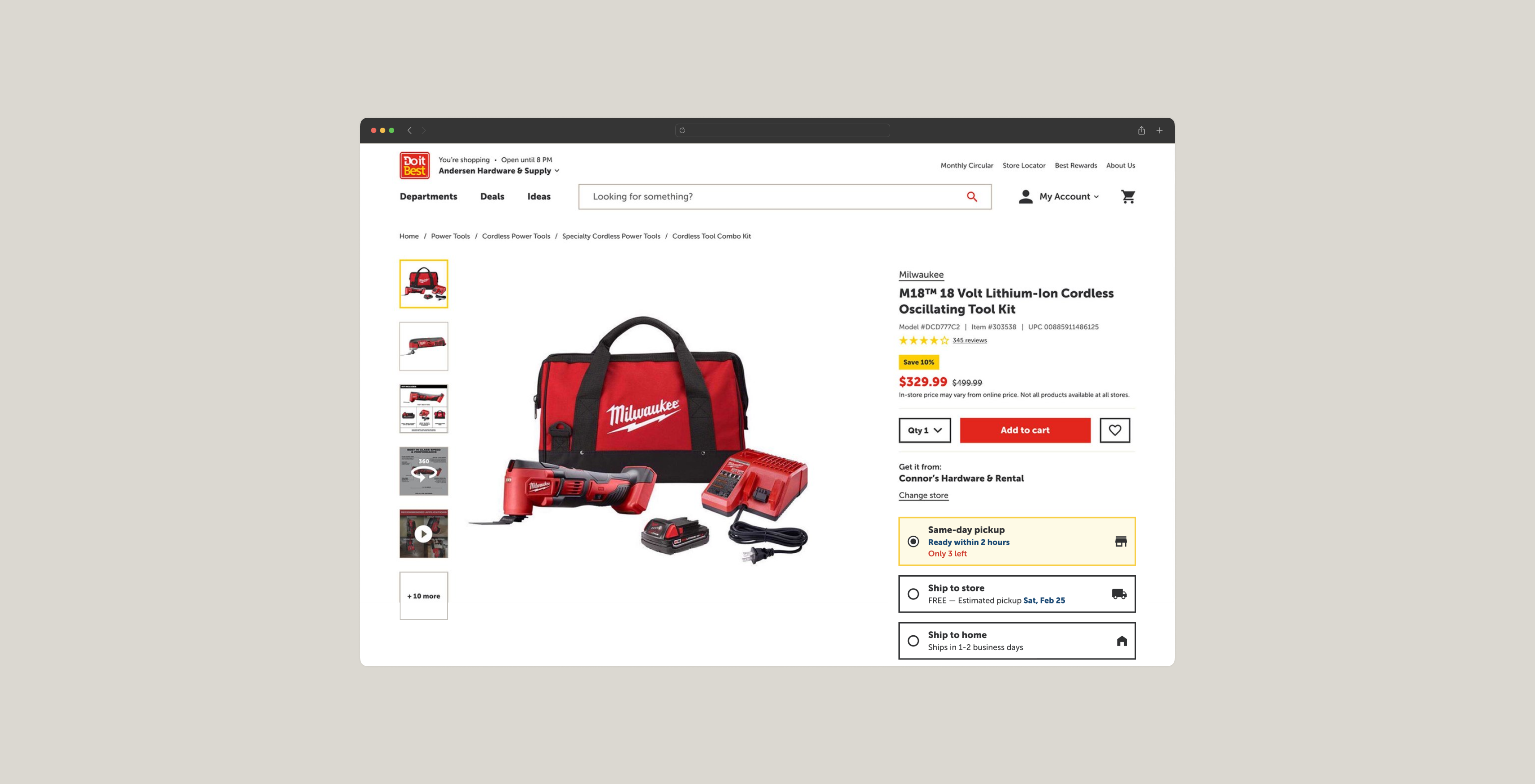
Product Detail Page

Store Locator
![]()

My List
Initial Outcomes & Impacts
The MVP was first soft-launched to a limited number of members. The following six weeks were spent on improvements in preparation for the full-release.
After MVP hard-launch, DiB initially found:
*40% decrease in click through rates and impressions due to pages not structured or optimized for SEO
*An initial drop in sales and conversion rates
From this data, the team prioritized SEO strategy as the next action, prioritized redesigning the bottom funnel strategy, and installed a behavior analytics software (Hotjar) paired with Google Analytics for weekly tracking sessions as next steps.
After MVP hard-launch, key insights DiB gathered from qualitative and quantitative data include:
* 45% increase in mobile engagement
* Uptick in member microsite site traffic and sales post-migration due to BOPIS fulfillment option
* Overall positive feedback from members in post-launch interviews
Takeaways
- How to design with technical restraints while balancing business needs with user experience
- How to adapt to organizational challenges and changing business requirements while successfully delivering designs on time
- Learning how to set up a clean, organized, and scannable Figma file for multiple people collaborate on
- Learning how to work with a large cross-functional team (20+!) with strict deadlines
Some feedback from my team:
“Cheri has been an extremely valuable member on our team. She is a wonderful active listener, participates in cross-functional conversations, and processes and asks questions, thus producting valuable user experiences based on client needs and known technical limitations.”
-Product Manager
-Product Manager
“Cheri brought a fresh perspective to the project which helped her to create experiences that spoke directly to the clients interests. She built positive relationships with clients and partners by fostering open communication, collaboration, and trust, leading to a successful outcome for this project.”
-Associate Creative Director
-Associate Creative Director
“Cheri’s attention to detail and user-centric approach have really made a difference in the overall usability and satisfaction of the product and has resulted in a seamless and intuitive experience for users. The visuals are aesthetically pleasing and functional, making it stand out in the market.”
-Lead Project Manager
-Lead Project Manager
More Projects

Designing a future state vision for the Manscaped site navigation, browsing, and shopping experience
Learn more ︎︎︎
Learn more ︎︎︎

Audit of the Intel search experience resulting in the design and delivery of 4 features including an advanced search.
Learn more ︎︎︎
Learn more ︎︎︎
let’s chat!
designed by cheri wang & running on Cargo